
INTRODUCTION
Gray paint colors for walls have surged in popularity, becoming the new neutral that offers a contemporary twist on the traditional beige and brown. The reasons for its rise to fame are multifaceted:
- Gray’s versatility seamlessly integrates with diverse design styles, from minimalist to industrial chic.
- It serves as an ideal backdrop that allows other colors to pop, while holding its own as a statement shade.
- The color gray imbues spaces with a sleek, modern vibe, cultivating an atmosphere that is both sophisticated and calming.
This article will guide you through the top 5 Benjamin Moore gray paint colours that promise to transform your walls into canvases of understated elegance. You will discover shades ranging from light grays with warm undertones to dark, moody charcoals. Each color selection has been thoughtfully chosen for its unique ability to enhance any living space:
- Barren Plain
- Coventry Gray
- Kendall Charcoal
- Escarpment or Vintage Pewter
- Flint
Whether you’re considering a complete makeover or a subtle refresh, these gray hues offer limitless potential for creating inviting interiors.
1. Benjamin Moore — Barren Plain
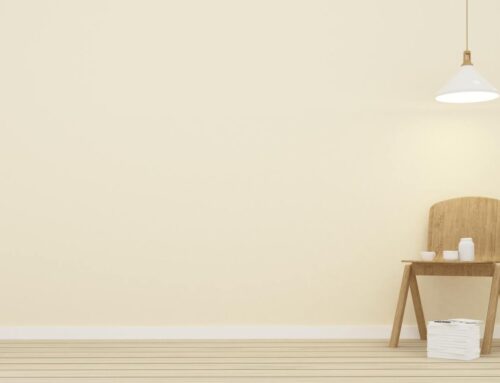
When choosing the lightest gray to bring a modern yet warm look to your home, Benjamin Moore’s Barren Plain stands out with its inviting balance of color tones. Known for its light gray shade, Barren Plain has subtle brown undertones that bring natural warmth to any space. This color is a great choice for those who are new to gray paint colors because it is versatile and understatedly elegant.
Features of Barren Plain:
- Light Gray Shade: As one of Benjamin Moore’s lightest grays, it provides a soft background that brightens up rooms without feeling harsh or cold.
- Subtle Brown Undertones: Unlike cooler grays, these undertones add a cozy touch, making your room feel more welcoming.
- Natural Warmth: This warmth ensures that the color doesn’t veer towards a sterile or industrial look, but instead maintains a comfortable atmosphere.
Enhancing Your Decor:
Barren Plain works well in rooms where you want to create a sense of harmony between new and existing elements. If your home has:
- Brown Floors: The gray paint color complements natural wood grains, enhancing their beauty.
- Espresso Furniture: It creates a smooth transition from furniture to walls, bringing together different elements within the room.
This particular shade acts as a neutral base, allowing you to add textures and colors without worrying about them clashing. Whether you prefer contemporary designs or timeless classics, Barren Plain adapts to reflect your unique style.
Perfect For Those New to Gray:
If you’re unsure about using gray in your color scheme, Barren Plain is the perfect choice to start with. Its ability to work well with brown floors and espresso furniture means it can easily fit into spaces transitioning from more traditional color schemes like beiges and creams. With Barren Plain, you get to experience the elegance of gray without any strong contrasts that might overwhelm first-time users of this subtle color palette.
Using Barren Plain on walls creates a backdrop that complements a variety of design choices while adding a sense of calm elegance to the space. It shows how selecting the right paint color can transform the atmosphere of a room without needing major changes to existing decor.
2. Benjamin Moore — Coventry Gray
Benjamin Moore’s Coventry Gray is a testament to the color’s adaptability and appeal in various settings. Characterized as a medium gray with a cool undertone, this paint color brings a fresh and contemporary feel to any room it graces.
Features of Coventry Gray:
- Versatile Medium Gray Shade: Coventry Gray stands out as a balanced option that injects modernity into spaces without overpowering them. Its neutrality makes it an excellent backdrop for both bold statement pieces and subdued decor alike.
- Cool Undertone: Unlike grays with warmer undertones that can sometimes pull towards beige or taupe, Coventry Gray maintains its crispness, thanks in part to its cool base. This characteristic makes it particularly attractive in rooms that aim for a more current or edgy look.
When considering wall colors, the interplay between shades and room elements is crucial:
- Pairs Well with Whites and Blacks: This gray paint colour thrives when matched with clean white accents, where it can create an illusion of more space and reflect natural light beautifully. Conversely, when paired with bold black elements, Coventry Gray presents an arresting contrast that adds a dynamic visual interest to interiors.
- Sense of Depth: The strategic use of this medium gray can have a transformative effect on walls, offering depth and dimension that may be lacking in smaller or less distinctively shaped rooms.
In specific areas of the home like bathrooms and kitchens:
- Clean and Airy Atmosphere: Given these rooms’ need for cleanliness and brightness, Coventry Gray is frequently recommended. It harmonizes seamlessly with bathroom marble or kitchen cabinetry, providing an understated yet elegant canvas for various design styles.
By choosing such a versatile hue as Coventry Gray, you open up endless possibilities for creative expression within your living space. It offers the perfect blend of neutrality and character—ideal for those seeking to strike a balance between traditional elegance and contemporary flair.
3. Benjamin Moore — Kendall Charcoal
Benjamin Moore’s Kendall Charcoal is a standout deep neutral shade that works well in a wide range of home designs. This particular gray paint color has a richness and versatility that allows it to pair beautifully with many other colors.
Key Attributes of Kendall Charcoal:
- Richness: It has a depth that goes beyond being just a background color; it becomes a standout feature.
- Versatility: It works harmoniously with creams, whites, browns, and taupes, making it an excellent choice for various design styles.
- Balance: Its underlying tones are carefully balanced to avoid leaning too warm or cool.
When you use Kendall Charcoal in your space, you bring in an element of drama and sophistication. As an accent wall color, it adds character without overpowering the room. Just imagine this shade behind a beautiful piece of art or as the backdrop to a tastefully decorated space—it elevates every element.
Using Kendall Charcoal:
1. Accent Walls with Character
As an accent wall color, Kendall Charcoal can:
- Highlight architectural features like fireplaces or built-in shelves
- Create a focal point in a room without overwhelming the senses
- Add depth and dimension to an otherwise plain space
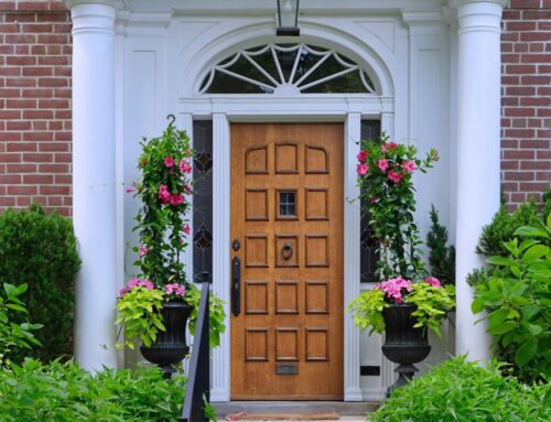
2. Statement-Making Front Doors
Imagine painting your front door in Kendall Charcoal:
- It instantly transforms your entryway into a statement piece
- The bold color choice reflects confidence and style
- Each brush stroke brings personality to your home’s exterior
Complementary Colors for Kendall Charcoal:
This shade’s ability to work well with other colors comes from its balanced underlying tones—it never strays into undesirable color territories. Whether paired with soft creams to enhance its subtle side, crisp whites to define its edges, warm browns to add earthiness, or subtle taupes to create interest, Kendall Charcoal remains steadfast.
Materials That Pair Well with Kendall Charcoal:
Kendall Charcoal not only looks great on its own but also complements various textures and materials commonly found in homes:
- Fabrics: Silk curtains or linen sofas gain an elevated look against this shade.
- Metals: From brushed nickel to oiled bronze fixtures, each finds harmony with Kendall Charcoal.
- Wood: Rich mahogany bookcases or bleached oak floors contrast beautifully with this color.
Spaces Where Kendall Charcoal Shines:
In areas where sophistication is key, such as executive offices or formal dining rooms, Kendall Charcoal is a perfect choice. Its depth creates a sense of luxury and elegance. However, don’t limit this versatile color to just formal spaces; it can also work wonders in cozy nooks or media rooms where you want to create a cozy and inviting atmosphere.
By selecting Kendall Charcoal for your walls or key design elements in your home, you’re embracing a color that provides both a solid foundation and an eye-catching touch—a truly versatile player in the world of gray paint colors.
4. Benjamin Moore — Escarpment or Vintage Pewter
When you want a sophisticated yet subtle wall color, Benjamin Moore offers two great options: Escarpment and Vintage Pewter. These medium-tone gray paint colors have a touch of brown, bringing warmth to your walls without overpowering the room.
Escarpment
- Subtle Warmth: With its slightly stronger brown undertones, Escarpment adds a welcoming warmth that goes well with different textures and finishes.
- Versatile Background: It works with various color palettes, from bright shades to soft tones, making it a flexible choice for any interior design style.
- Complementary Pairings: The medium depth of this gray shade makes it a perfect match for charcoal accents or light neutral furniture, creating a well-balanced look in your space.
Vintage Pewter
- Understated Elegance: Vintage Pewter has a subtle touch of brown, giving it a timeless and contemporary elegance.
- Harmonious Contrast: When combined with charcoal accents, it creates a beautiful contrast that elevates the overall design without being too overpowering.
- Light Furnishings Friendly: Light neutral furniture pieces blend seamlessly with Vintage Pewter, resulting in a cohesive and carefully curated environment.
Both Escarpment and Vintage Pewter strike the perfect balance between being unique yet understated. With their own special mix of brown and gray tones, they ensure that your space feels personalized and inviting. Whether you’re using these colors for large living areas or cozy corners, they will harmonize with other elements in the room.
By choosing either Escarpment or Vintage Pewter thoughtfully, you can create an elegant atmosphere that complements your home’s architecture and decor. These medium-tone grays are not only visually pleasing but also adaptable enough to suit changing styles and preferences over time.
5. Benjamin Moore — Flint
When you choose Benjamin Moore’s Flint for your walls, you’re selecting a paint color that’s mysterious and elegant. Here are the key features of this unique shade:
- Dark Blue-Based Charcoal-Gray: Flint stands out among gray shades with its dark blue undertones, offering a cooler spectrum that brings both intensity and tranquility to your space.
- Moody and Rich Feel: Ideal for creating an atmosphere filled with depth, Flint is perfect for rooms where you want to make a statement without uttering a single word.
- Pairs Well with Rustic Grey Stains or Taupes: This gray paint color harmonizes beautifully with rustic elements and natural materials, striking a balance that feels both grounded and elevated.
Imagining Flint in Different Spaces
Here are some ideas on how you can incorporate Flint into various rooms:
- Master Suite: Use Flint as an accent wall behind the bed. Pair it with soft linen drapes and distressed wood nightstands to create a peaceful retreat.
- Living Room: Paint the walls with Flint in a living room with large windows that bring in lots of natural light. Throughout the day, the color will change from a solid background to a more dynamic element in your home’s overall look.
- Office: Bring an edgy vibe to your workspace by combining Flint with sleek modern furniture and metal accents.
The versatility of Benjamin Moore’s Flint is what makes it so appealing. Whether you want to establish a cozy corner or add sophistication to your dining area, this dark blue-based charcoal-gray shade can easily adapt to any desired atmosphere. Its ability to work well with different textures and complementary colors allows you to effortlessly enhance your design scheme using Flint.
Choosing the Perfect Gray for Your Space
Selecting the ideal gray paint colour involves more than just picking a shade you like; it’s about ensuring that your choice harmonizes with your room’s existing elements. Furniture compatibility and lighting conditions play pivotal roles in how a gray paint colour will ultimately look and feel in your space.
Assess Your Furniture
Take a close look at the hues and tones present in your room’s furniture. A gray with brown undertones, like Benjamin Moore’s Barren Plain, can complement natural wood elements, whereas a cooler gray might be the perfect backdrop for more contemporary pieces.
Lighting Is Key
Observe the natural and artificial lighting conditions of your room at different times of the day. North-facing rooms might benefit from warmer grays to offset the cooler light, while south-facing spaces can often support cooler grays.
Test Before You Commit
Paint large swatches on different walls or use poster board that you can move around the room. This allows you to see how the color changes under various lighting conditions throughout the day.
By considering these factors, you ensure that the chosen gray paint enhances your room’s design rather than clashing with it.
Explore Other Neutral Colors
While gray is a popular choice for creating a stylish and flexible backdrop in any room, there are other neutral colors that can achieve the same effect. White and beige paint colors also offer versatility, making them suitable for various design styles from minimalistic to rustic charm.
White Paint Colors:
- Serve as a clean canvas, making the room appear brighter with natural light
- Give an illusion of more space in smaller rooms
- Create a striking contrast when paired with bold accent colors or can be layered for a seamless monochromatic look
Beige Paint Colors:
- Bring warmth and coziness, making them perfect for creating inviting spaces
- Blend effortlessly with earthy textures and natural materials
- Provide a subtle backdrop that allows vibrant artwork or colorful textiles to stand out
If gray doesn’t quite align with your vision, white and beige are excellent alternatives. Each color has its own unique qualities that can enhance the atmosphere of your walls. For more detailed guidance on choosing the perfect white or beige shade for your walls, check out our dedicated articles on these colors.
Remember, the best color for your space is one that reflects your personal style and complements the lighting and furniture in your home. Whether you prefer the crispness of white, the warmth of beige, or the sophistication of gray, you have a range of neutral options available to create the ambiance you desire.
Conclusion
Gray is a versatile paint color choice that never goes out of style. It can work well with any design style and in any room. Whether you prefer a modern look or a more traditional feel, the shades of gray discussed in this article offer endless possibilities for personalization and creativity.
- Benjamin Moore’s Barren Plain to Flint, each shade provides a unique foundation from which to build your interior palette.
- From the light and subtle warmth of Barren Plain to Flint’s deep and mysterious undertones, these grays cater to diverse aesthetic preferences and design needs.
- You are encouraged to explore each gray color mentioned here, thinking about how they might enhance your space and showcase your personal style.
Remember, it’s important to try out these colors in your own home. See how they look alongside your furniture, under different lighting conditions, and in various parts of the room. Trust your instincts and have fun transforming your space with the timeless elegance of gray.
Leave A Comment